The Benefits of a Standardized Identity
The purpose of a standardized brand, as defined and described in this manual and implemented within an integrated marketing programme, is to present our identity through an easily-remembered positive public image.
Consistency in all applications of a standardized brand significantly enhances our university's communication efforts to convey a professional and positive image to our valued constituencies. In a crowded marketplace, a standardized brand that is attractive and representative of our university can compete more effectively for new students, faculty and funding resources.
This manual is the official reference and provides guidelines for all university faculties and departments. It has been compiled to direct anyone who writes, edits or designs printed, electronic, or other publications and materials for and about the University of Cyprus.
Easy to implement, the manual covers a variety of formats and applications, with a flexibility that allows university departments to retain their individuality and capitalize on the benefits of a standardized brand. Consistent and conscientious use of this manual will ensure that UCY guidelines are being properly applied to official stationery, university web sites, products, publicationsand collateral materials.
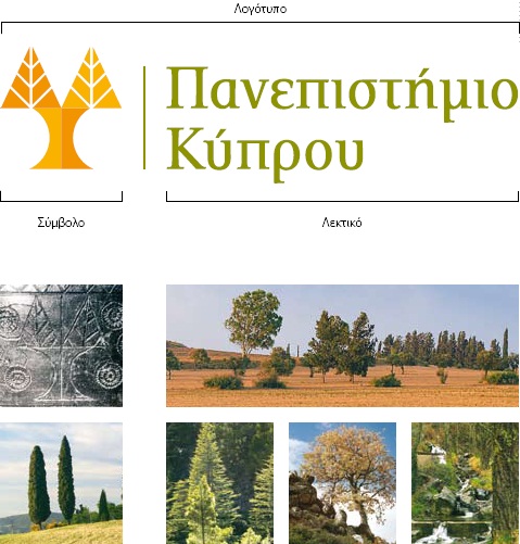
| Design Rationale The logo has been designed and developed based on the following rationale: • The logo provides the University of Cyprus with a vibrant and unique icon that reflects its mission and values. • The symbol is derived from a double cypress tree found carved on a 19th century wooden chest, enhanced with a contemporary twist. • The gold colour is a blend of orange and yellow, which expresses energy, vitality, spirituality and communication. The green colour of the type is an expression of learning, development, renewal and hope. • The gold and green colours were adopted from the Cyprus national flag and also project the colours of the natural beauty of the island. • The criss-cross combination of the orange and yellow (gold colours) generates movement and adds life and energy. • The typeface was chosen to be practical and modern. • The complete design was conceived to allow flexibility when implemented in schools and departments, as well as for a wide range of applications including advertising, the web and printed material. |
 |